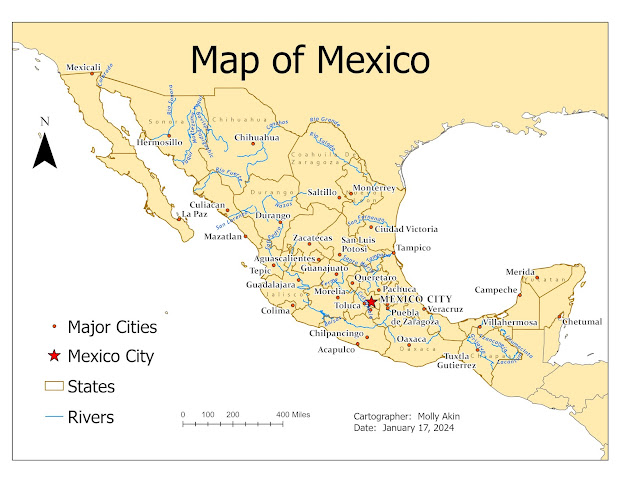
For Module 1, we reviewed concepts on map design and typography. We learned about the five principles of map design which includes: legibility, visual contrast, figure-ground, hierarchical organization, and balance. We were provided with a map of Mexico, along with various features which required labels. We were required to utilize labels for states, rivers, and major cities.
Below is the map I created for this assignment. I was especially excited to learn some new things when I worked on this map. I was unaware of the other options in the Labelling Options/More dropdown (priorities, weights, etc). Learning about and using this feature really set me up for success when designing this map. I set up priorities for the different features, making the rivers the least important. Setting up weights and priorities allows the more important features to be layered over the less important features. I also made a new feature class for Mexico City and made another one for all cities except for Mexico City. This allowed me to create a separate symbology for Mexico City and create this as a focal point (as the capitol). I used several different types of labelling options for the different feature types (Labelling/Text Symbols) to help with visual contrast and legibility. I attempted to balance the map by placing the map elements in the map's white space and unlabeled areas.


No comments:
Post a Comment